Chronic Absenteeism in NYC Public Schools
These projects use open source data on NYC public schools, walkability, and test scores.
Here
is a link to my final project for ORCSE4200: Data Driven Decision Modeling at Columbia University. I
explore the same
dataset with various machine learning models to find indicators of future absenteeism issues. With
more data, these models could be used a predicitive tools for Department of Education officials to
be proactive about keeping students in school. This project uses exploratory vizualization early on,
and the rest of the project focuses data analysis.
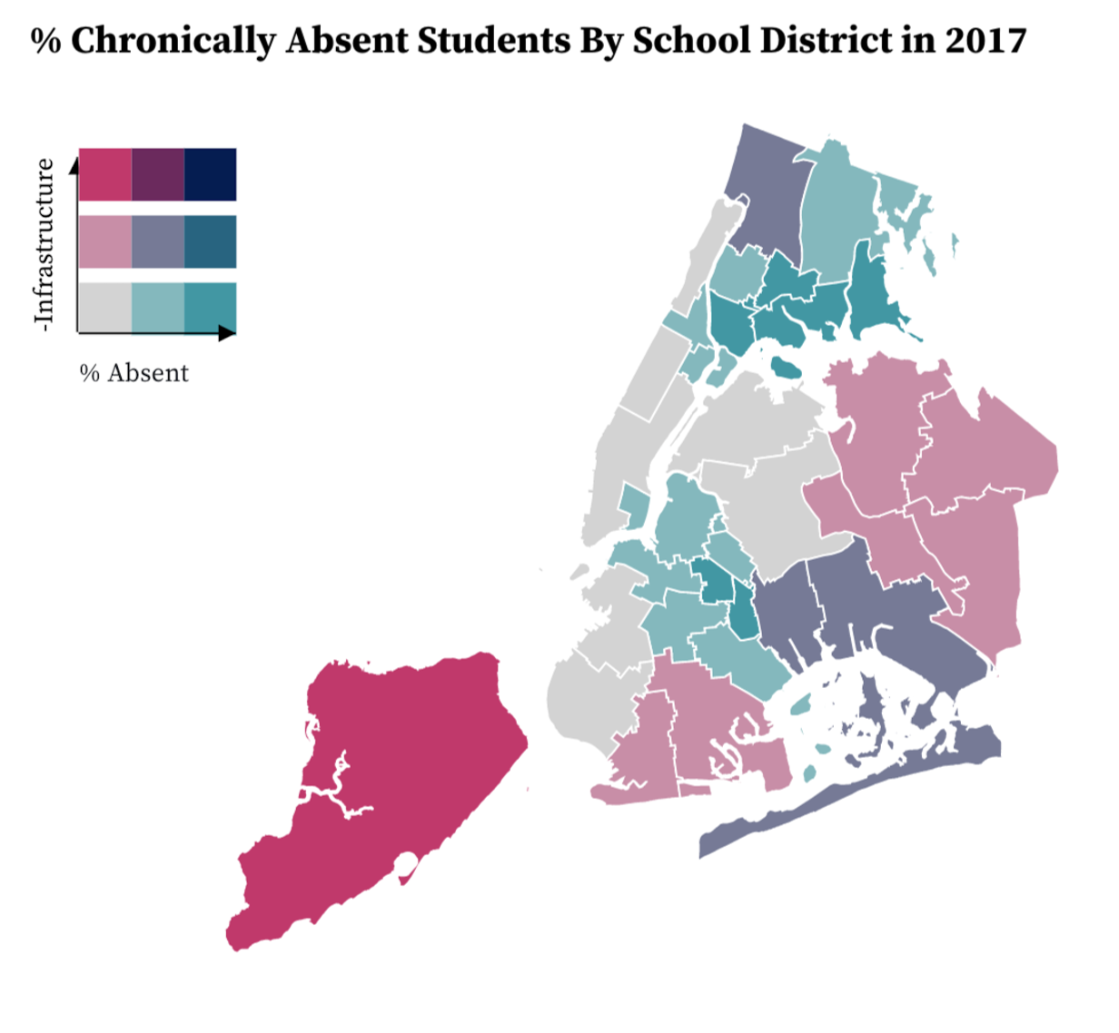
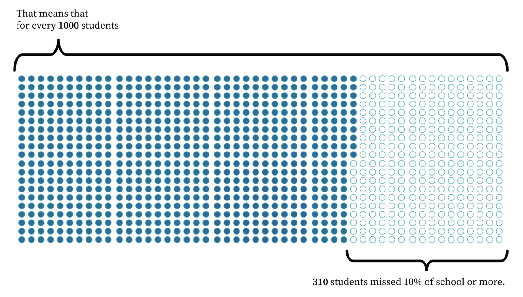
Here is a
link to my final project for COMSW4995: Data Visualization at Columbia University. We explore the
impact of the COVID-19
pandemic on chronic absenteeism, and relate it to district demographics, standardized test scores,
and the quality of civic infrastructure in surrounding neighborhoods. This project has several
visualizations, which you can see at the above link.
Tools Used: D3, Adobe Illustrator, Python,
December 2022, May 2023
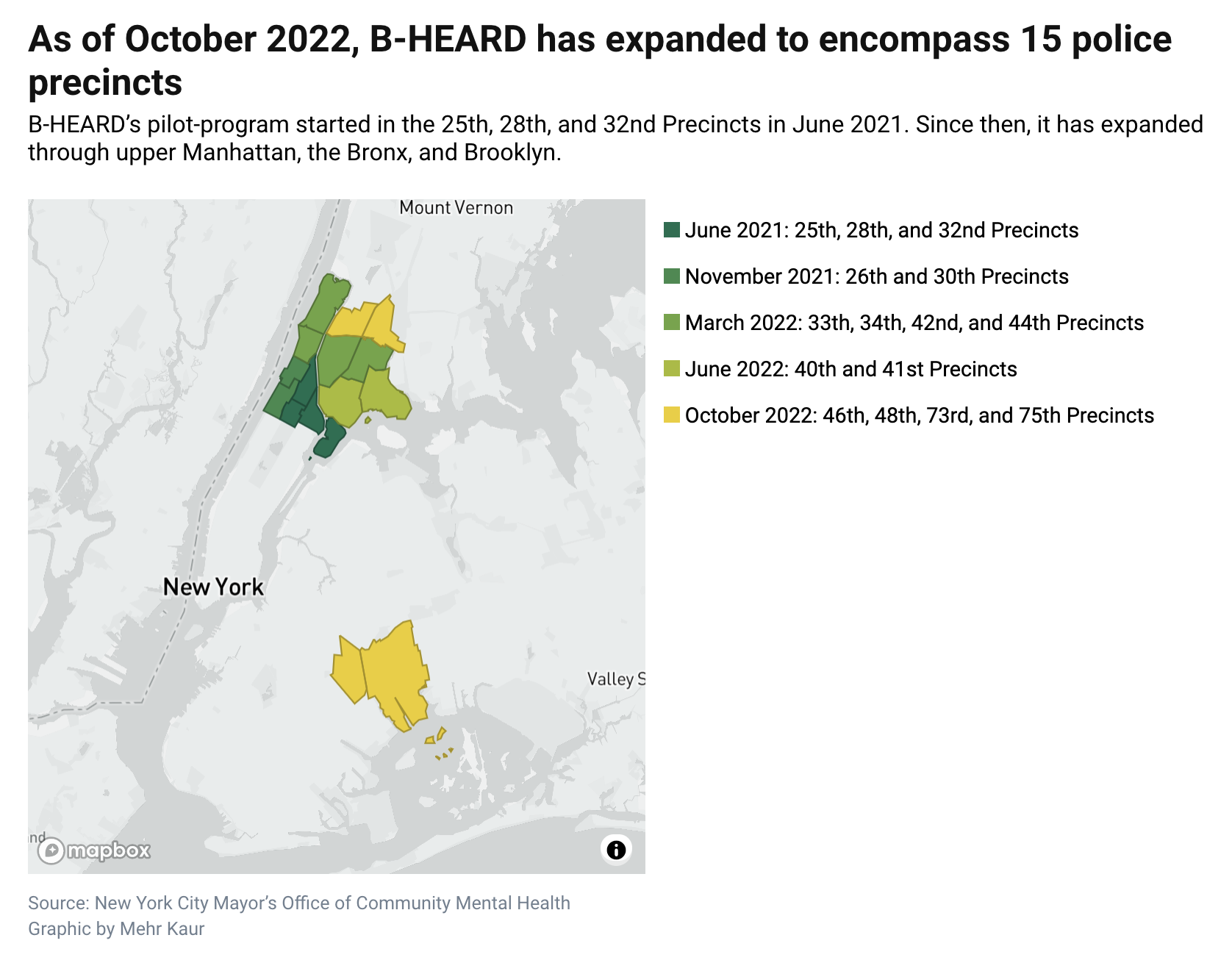
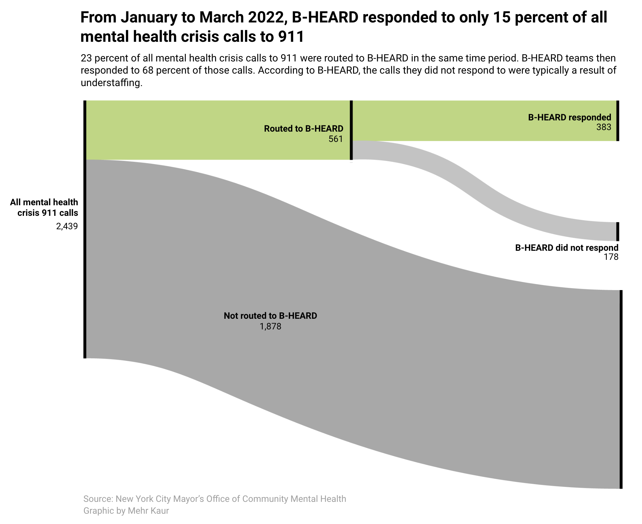
NYC non-police response teams for mental health crises (B-HEARD)
This article reviews the impact and growth of the B-HEARD mental health crisis response team in NYC. I created an map showing the growth of B-HEARD since its pilot program and an alluvial diagram showing how many 911 calls they responded to. To view the graphics in the published article (including the interactive map), please click here.
Tools Used: MapBox, HTML, CSS, JavaScript, Adobe Illustrator, RawGraphs
October 2022
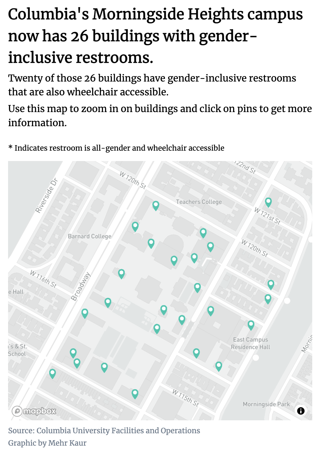
A History of LGBT spaces and policies at Columbia
This story focused on LGBT student spaces and organizations at Columbia over time. Recently, Columbia's Morningside campus expanded the number of gender neutral bathrooms available to students. I created an interactive map showing how these bathrooms are distributed around campus. To view the this map interactively in the published article, please click here.
Tools Used: MapBox, HTML, CSS, JavaScript
October 2022
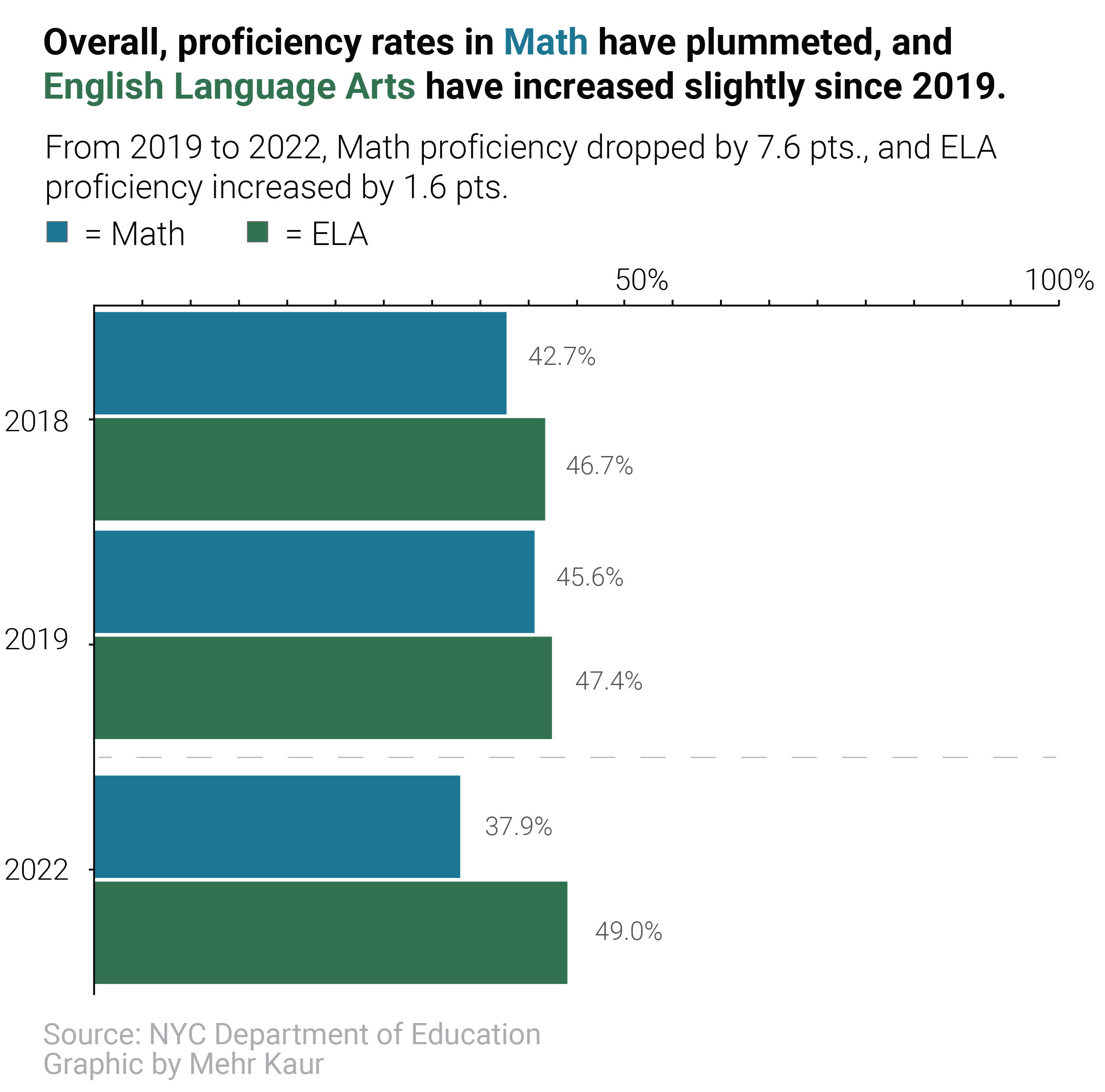
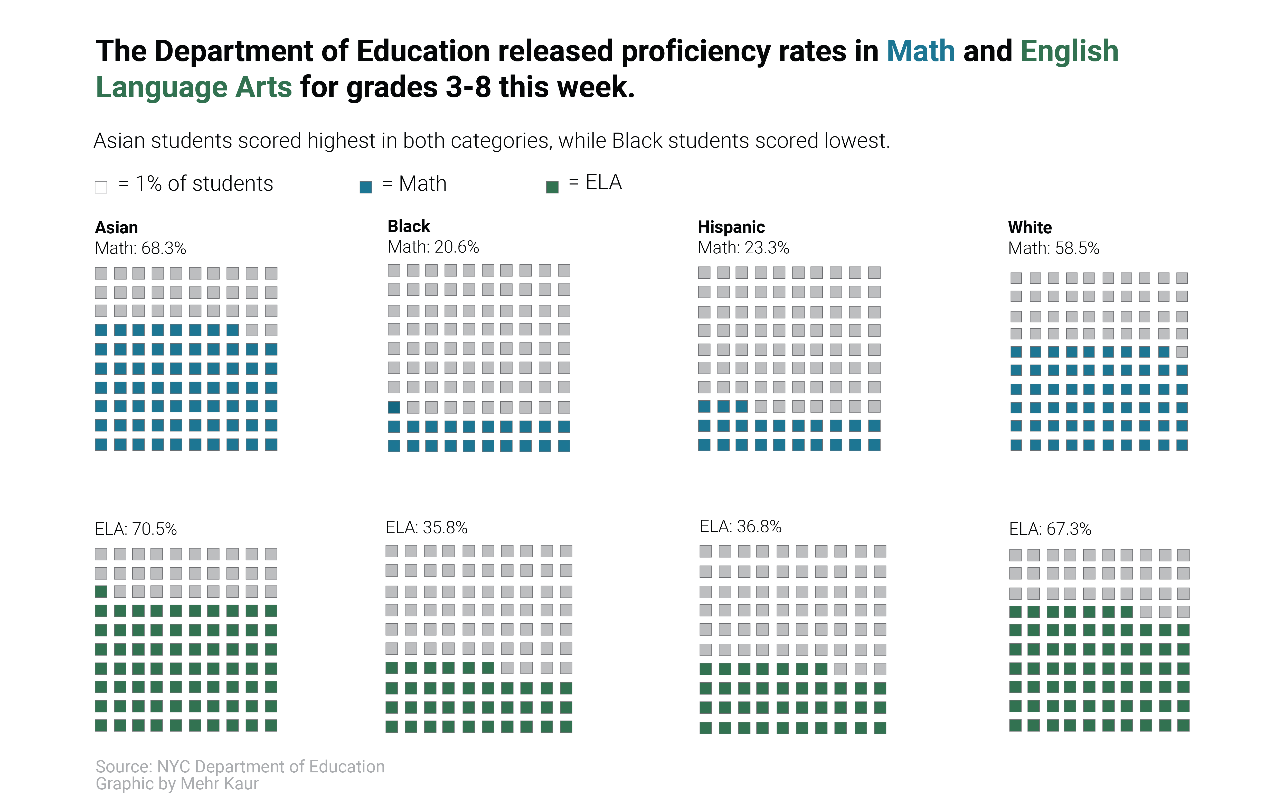
NYC Department of Education Math and ELA Proficiency Scores
This breaking story discussed a drop in Math Proficiency among grades 3-8 in NYC. These graphics show that this overall drop disproportionately impacted Back and Hispanic students. To view the graphics in the published article, please click here.
Tools Used: Adobe Illustrator, RawGraphs
September 2022
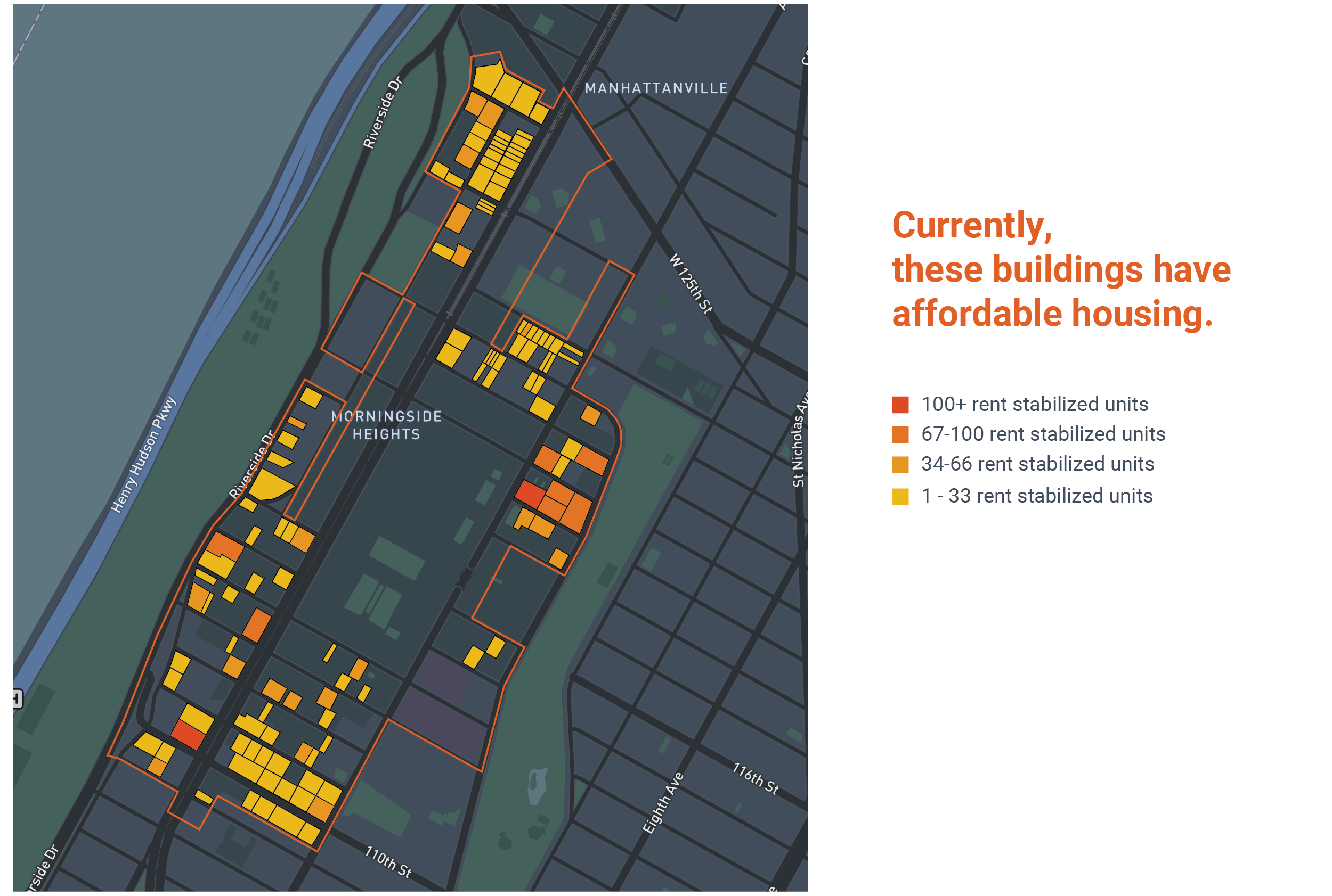
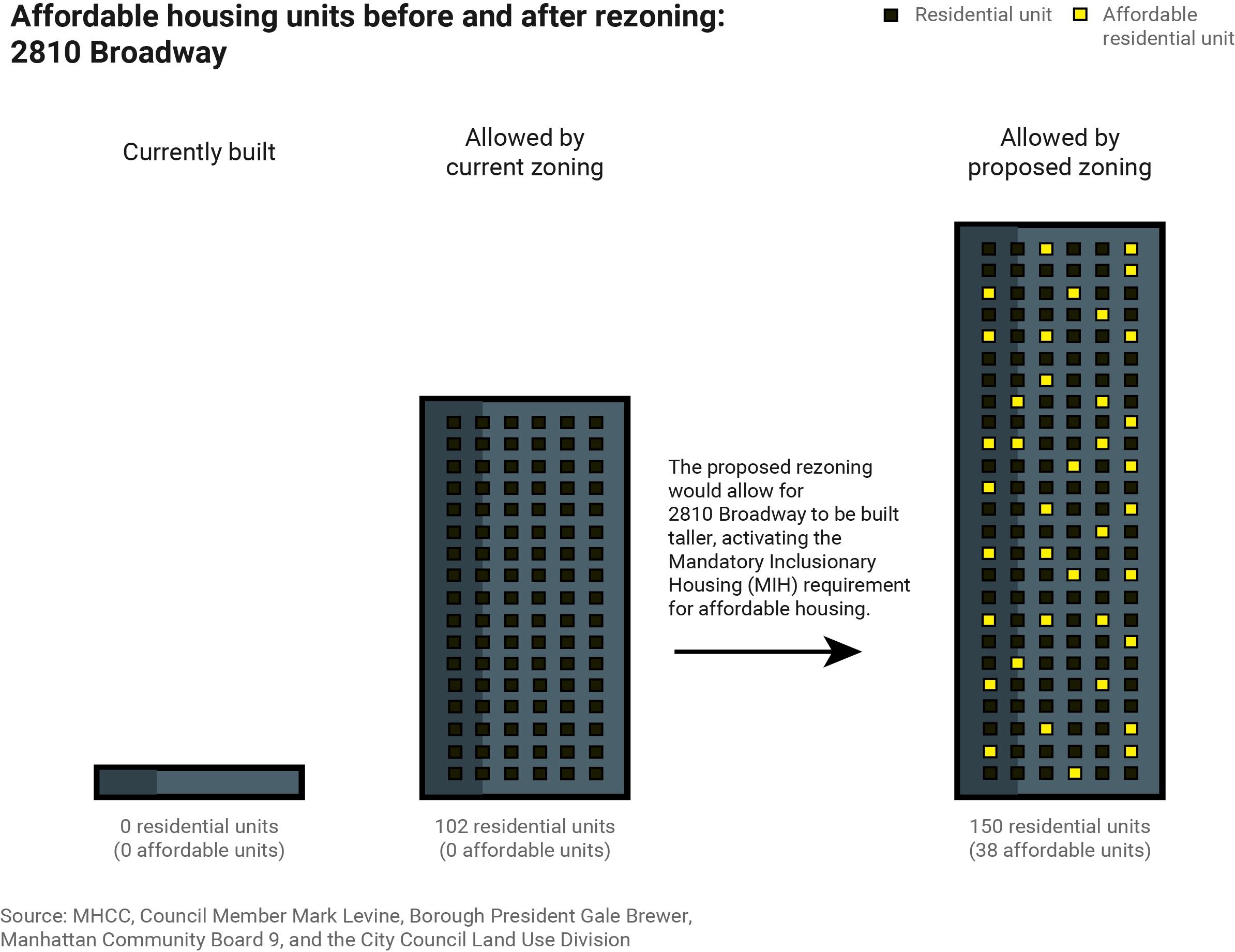
Morningside Heights Upzoning Proposal
These graphics explain the cause and potential impact for proposed rezoning in Morningside Heights, Manhattan. The first graphic shows how the rezoning would allow for more affordable housing units in the area, and the second maps where affordable housing units are currently. To view the interative graphics in the published article, please click here. The rezoning proposal can be found here.
Tools Used: Adobe Illustrator, MapBox, JavaScript
September 2022
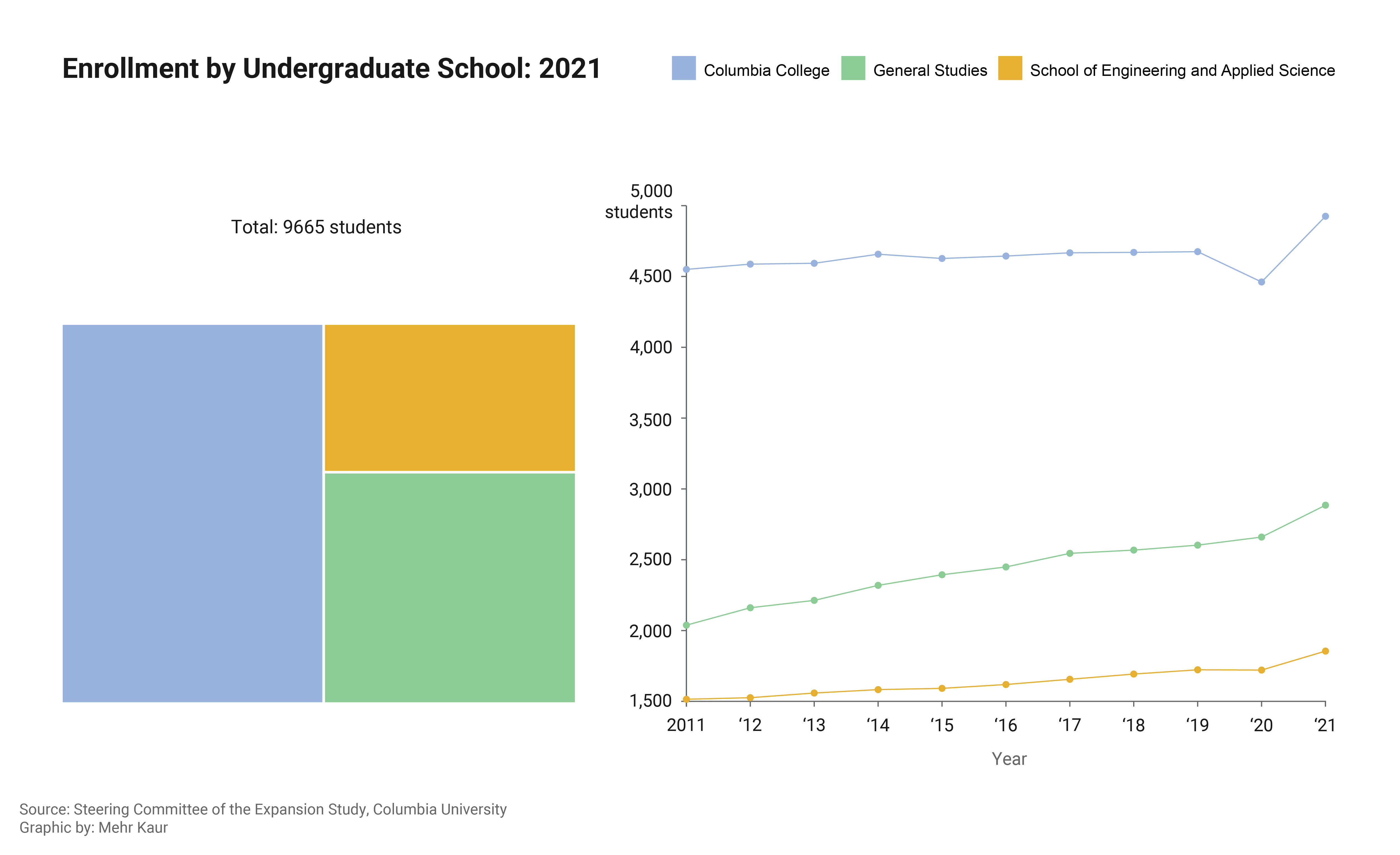
Columbia University Enrollement by School: 2011-2021
This scrollie has 10 frames depicting the overall and relative growth of Columbia University's undergraduate schools. This data provides quantatative context to discussions around the expansion of these schools. To view the interative graphics in the published article, please click here.
Tools Used: Adobe Illustrator, JavaScript, RawGraphs
September 2022
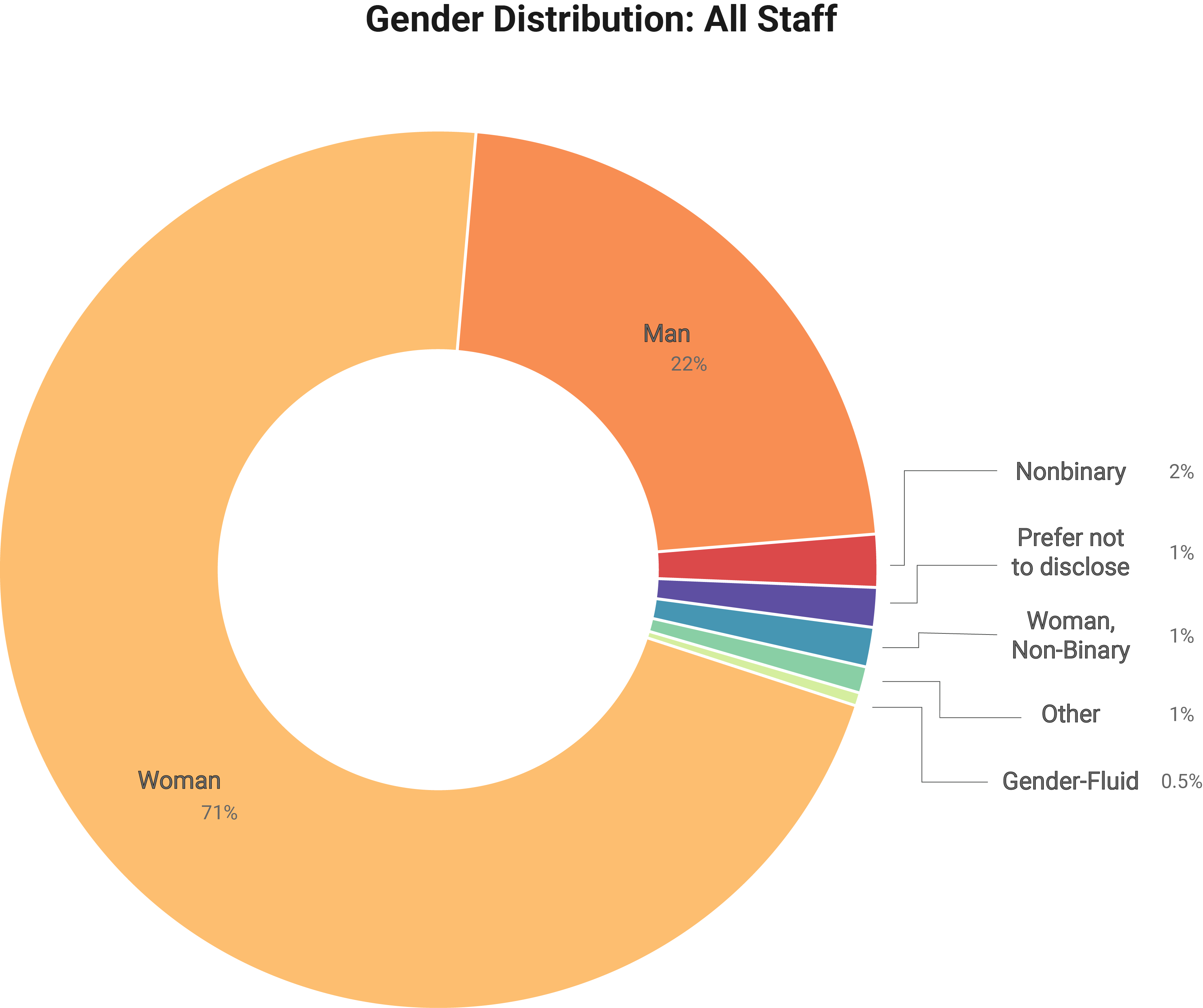
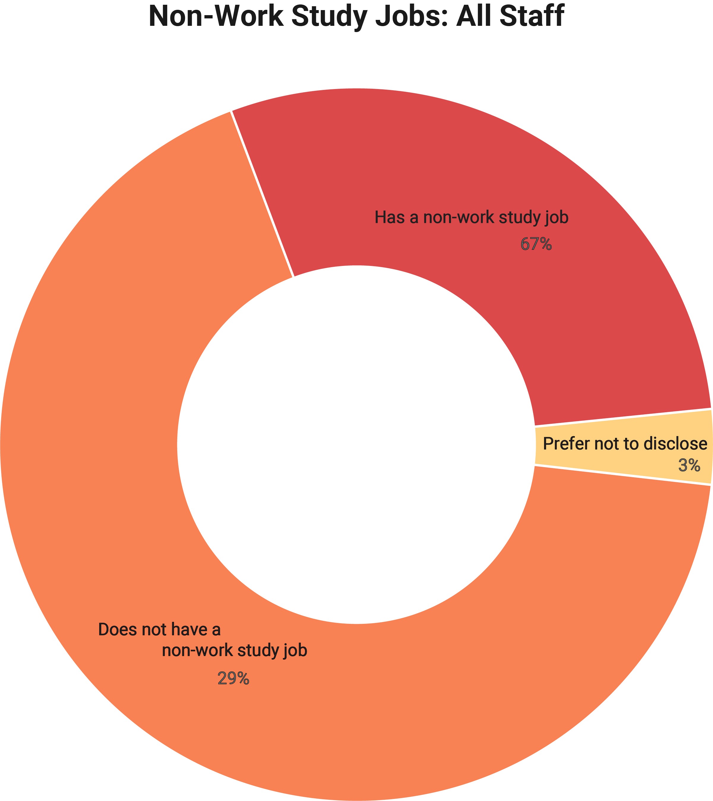
Diversity, Equity, and Inclusion Report 2022: Columbia Daily
Gender Distribution and Outside Employment across all departments of the Spectator Publishing Company in the 2021-2022 academic year. To be published in Spectator's annual DEI report.
Tools Used: Adobe Illustrator, RawGraphs
May 2022
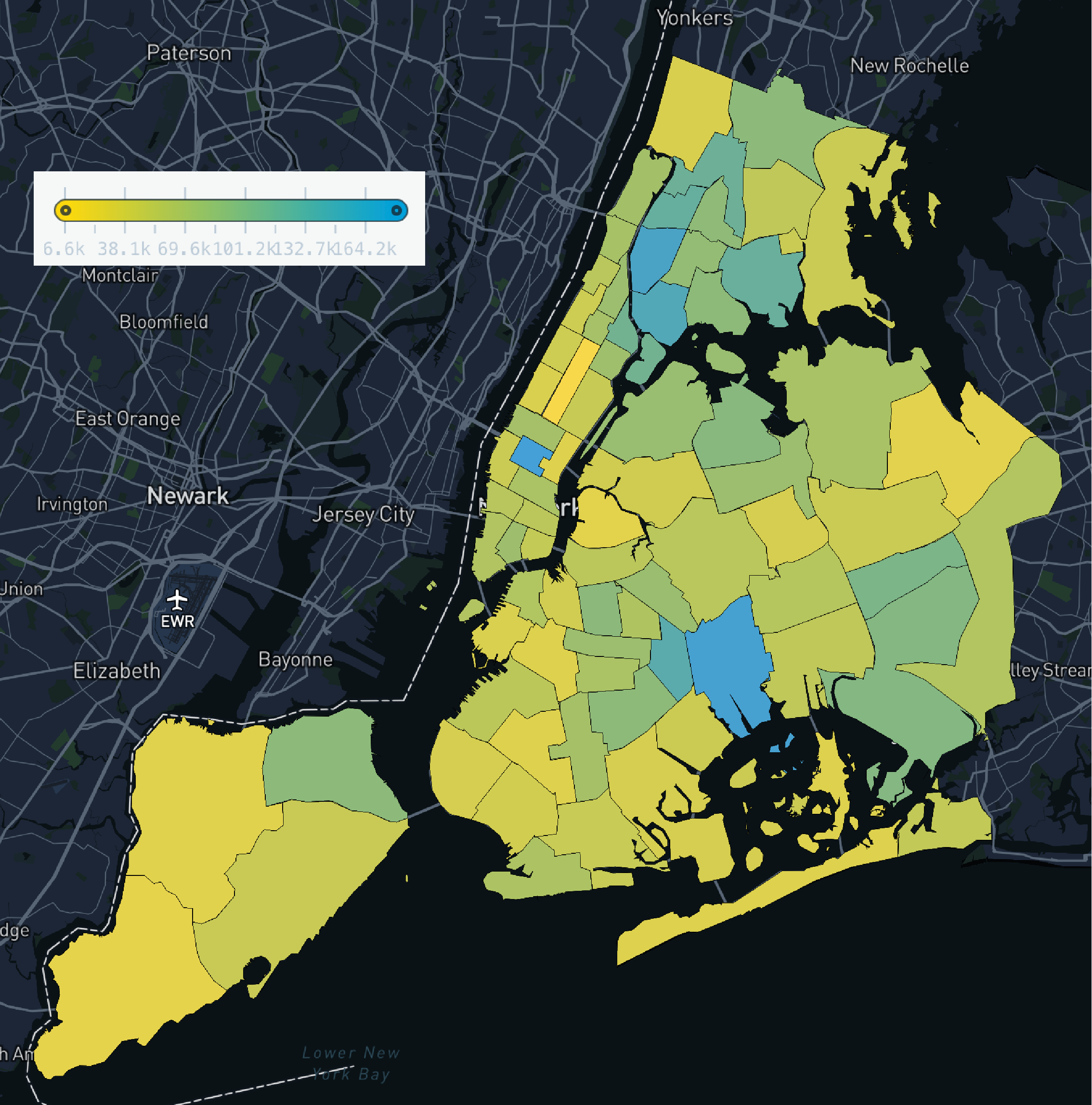
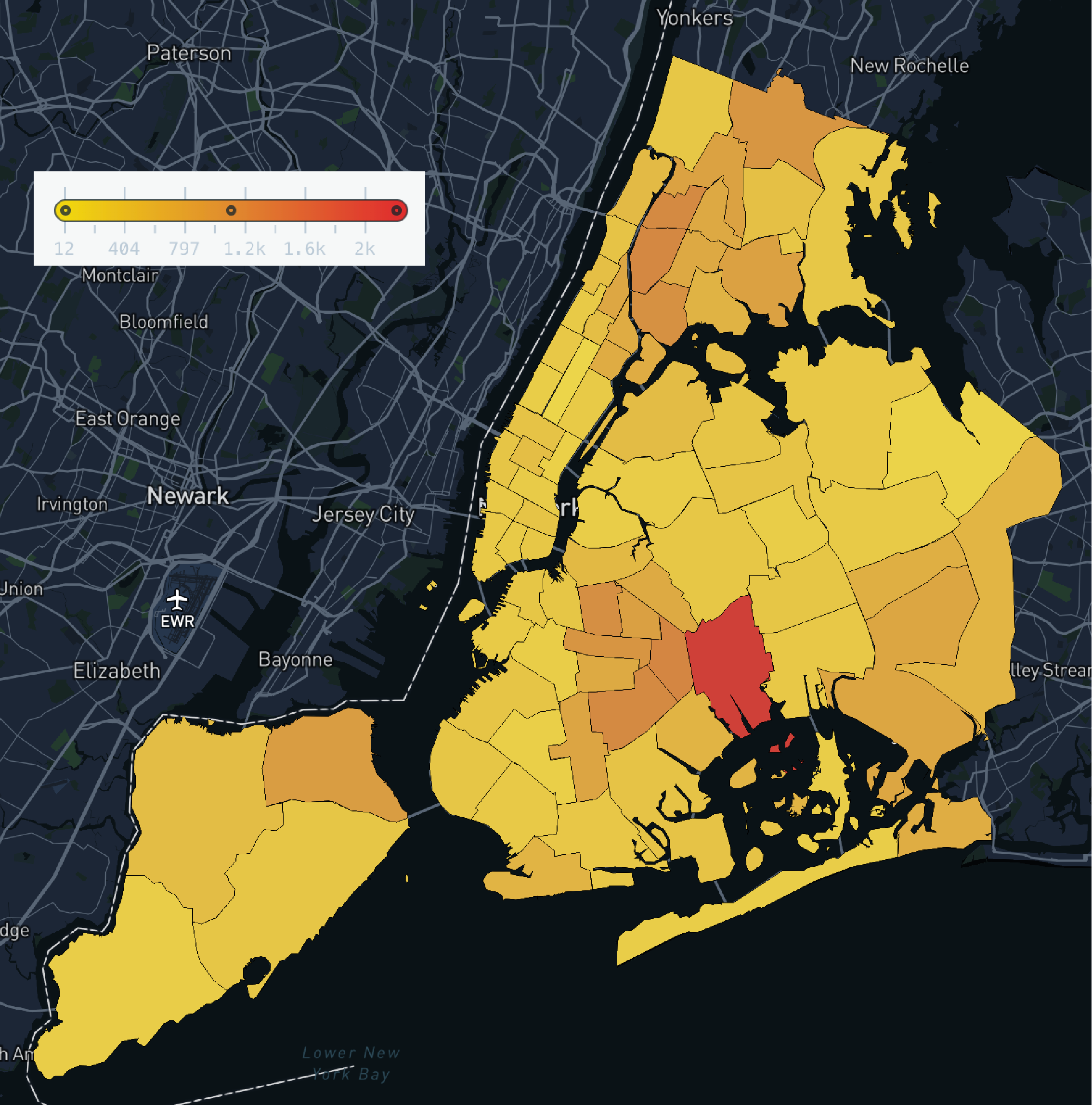
Arrests and Allegations of Police Misconduct by NYC Precinct
While playing with open-source NYC data (OpenData and ProPublica), I found that the same police precinct was an outlier in number of arrests since 2013 (left) and in number of complaints against police officers filed between 1985 and 2020 (right). It would be interesting to further explore this potential relationship.
Tools Used: Adobe Illustrator, MapBox, Python, Pandas
March 2022
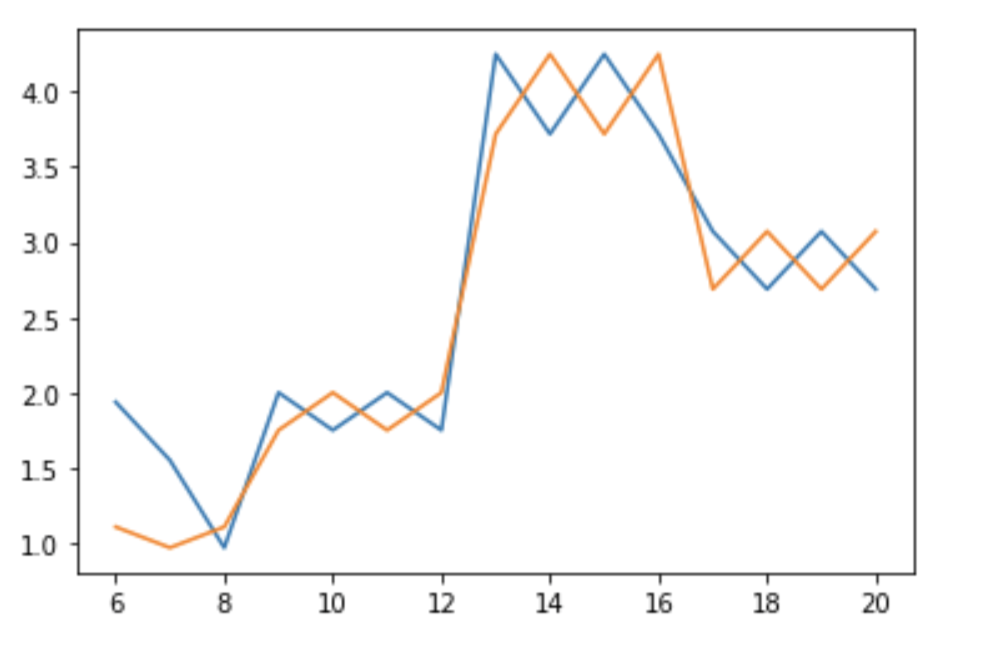
Stay Subway Safe
This project aimed to predict crowd size on NYC platforms at a given time of day to mitigate the spread of COVID-19. Using open-source data from the NYC MTA, I wrote an algorithm to report a risk level for individual platforms based on calculated crowd sizes and platform dimensions. This graph shows predicted risk level (0-4) for North- and South-bound trains at W. 116th Street station over the course of a given Saturday (24 hr clock). I wrote a walk-through of my team's work, found here.
Tools Used: MatPlotLib
August 2020